In today's digital landscape, where users increasingly access websites on various devices, responsive website design has transitioned from being an option to a necessity. With the rapid growth of mobile browsing and the diversity of screen sizes, providing an optimal user experience across all platforms is crucial. The release of Divi 5 Public Alpha has revolutionized how designers create responsive layouts, offering powerful and efficient tools that simplify the process. In this article, we will explore how to utilize Divi 5's features to develop stunning responsive designs.
The Importance of Responsive Design

Before delving into the specifics of Divi 5, it's essential to understand why responsive design is vital. A responsive website adapts to the resolution, platform, and device, ensuring that all users enjoy a seamless experience, regardless of how they access your content. Here are some reasons why responsive design matters:
- Enhanced User Experience: Users tend to leave websites that do not display correctly on their devices. A responsive design adjusts to various screen sizes, providing ease of navigation and readability.
- Improved SEO Rankings: Search engines such as Google favor mobile-friendly websites. A responsive design can potentially improve your site’s visibility and ranking in search results.
- Cost-Effectiveness: Maintaining a single responsive website is more cost-effective than developing and maintaining separate versions for desktops, tablets, and mobile devices.
- Adaptability: As new devices with different screen sizes emerge, responsive design ensures your website remains functional and visually appealing without needing constant redesign.
- Increased Conversion Rates: A seamless browsing experience often leads to higher conversion rates, as users are more likely to engage with content that is presented attractively and accessibly.
Given these benefits, it’s clear that responsive design is essential for any modern website, and Divi 5 provides the tools necessary to achieve this.
Introducing Divi 5: A New Era in Web Design
Divi 5, developed by Elegant Themes, is a sophisticated page builder that empowers users to create visually stunning and highly responsive websites with ease. With features tailored for both beginners and experienced developers, Divi 5 simplifies the process of responsive design through three primary tools:
- Seamless Device Switching
- Visual Breakpoints
- Canvas Scaling
Let’s explore each feature in detail.
1. Seamless Device Switching
One of the standout features of Divi 5 is its Seamless Device Switching capability. This tool allows designers to toggle between different device views—desktop, tablet, and mobile—without losing context or needing to reload the page.
How It Works:

- Adjusting Text and Headings: For instance, if you find that the heading text appears too large on the tablet view, you can switch to tablet mode, select the heading, and adjust its font size directly. This ensures that every heading is appropriately sized for easier reading on smaller screens.
- Customizing the Color Scheme: You can also tailor the color scheme for each device type. Say you want to update the button color for mobile. Simply switch to the mobile view, select the button module, and choose a different color.
- Simplifying the Design Process: This method allows you to see how your design evolves as you make adjustments, enabling you to create a site that looks great on all devices without unnecessary back-and-forth switching.
Example Usage:
As an example, if you want to change the button color to a soft green for tablets and keep it a bright yellow for desktop, you can do so with just a few clicks. When you switch back to the desktop view, the button will revert to its specified yellow color, ensuring that the design remains consistent across devices.
2. Visual Breakpoints
The Visual Breakpoints feature is an exciting addition to Divi 5 that provides real-time feedback, allowing precise design modifications for any screen size.
Implementation:
This feature allows designers to input specific screen widths to see how the design fits different resolutions. Here’s how to leverage visual breakpoints effectively:
- Custom Breakpoints: In the Divi 5 editor, navigate to the top bar and find the option for custom breakpoints. For instance, if you want to design specifically for devices with a width of 800 pixels, simply enter “800px” in the available field.
- Design Customization: Upon entering the width, the canvas will resize automatically. You can then make design changes—like altering text colors or adjusting image sizes that specifically cater to that breakpoint. For example, if you need a heading to be italic and white for screens at 800 pixels, you can easily implement those changes without affecting other views.
- Testing Multiple Resolutions: This functionality allows you to test various resolutions, ensuring that your design looks polished on all devices. By employing visual breakpoints, you can fine-tune details such as padding, margins, and font sizes for optimum display.
Real-World Applications:
Visual breakpoints are particularly useful for complex layouts or when designing elements that need to adapt at specific breakpoints. For example, if a navigation menu collapses at a particular width, using visual breakpoints to design for that threshold is crucial for maintaining usability.
3. Canvas Scaling

How to Utilize Canvas Scaling:
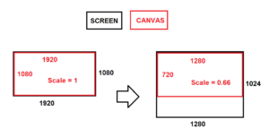
- Dynamic Adjustments: To test how your site looks across different resolutions, click and drag the edge of the canvas on the right-hand side of your workspace. By expanding and contracting the canvas, you can visually assess how responsive design elements behave as the size of the viewport changes.
- Quick Iterations: This method of adjusting the canvas makes it easy to see what works and what doesn’t in real-time. You can make adjustments to layout, images, and text without needing to switch between device views.
- Optimization: After testing different screen sizes, you can widen or narrow your canvas again to implement the changes determined by your assessments. This iterative approach aids in optimizing the layout for the best user experience across platforms.
Example of Canvas Scaling:
Imagine you have created a multi-column layout. Using canvas scaling, you can see how the columns stack or shift as the screen size changes. This enables you not only to achieve a visually appealing structure but also to ensure usability as elements adjust to fit smaller screens.
Conclusion
Creating responsive website designs with Divi 5 has never been easier or more intuitive. By employing features like Seamless Device Switching, Visual Breakpoints, and Canvas Scaling, designers can craft websites that provide a seamless user experience across all devices.
Don't wait to elevate your web design skills! Experiment with Divi 5 today and unlock the full potential of responsive design. Dive into the user-friendly interface, explore innovative features, and start building beautiful websites that look perfect on every device. Join the community of designers leveraging Divi 5 to create stunning online experiences, and embark on your journey towards mastering responsive web design!
Thank you for reading, and happy designing! Embrace the future of web design with Divi 5 and watch as your websites transform into responsive masterpieces.


0 Comments