


The Divi Responsive Helper allows the user to easily instantly fix windows, change sizes of device preview, and insert column stacking straightforwardly to Divi Visual Builder!
Key Features
Configure the builder Custom Preview Size
The Divi Responsive Helper plugin provides custom preview sizes instantly to the Divi Visual Builder. With the current range of options, you can easily use one of the configurable presets or insert a custom value. Start taking full advantage control of the three standard responsive set points in Divi through using their instant, customizable preview size to create your Divi website responsive to the pixel!
The Cyber Monday sale has officially begun! For a very limited time, Divi are offering our biggest discount of all time plus free bonus gifts and exclusive perks...and that's just the beginning! Once Cyber Monday is over, this crazy deal won't be back until next year Divi Theme Discount today!
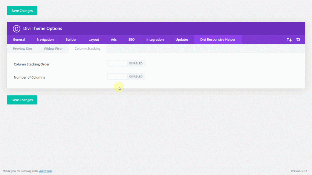
Assign Column Stacking Order
You don’t have to insert insane code or blow your brains out attempting to change the stacking order of the column. Easily use the Custom Column Stacking Configuration Divi Responsive Helper throughout every row and column inside the Divi Builder to modify the order within each column stacks on your device.
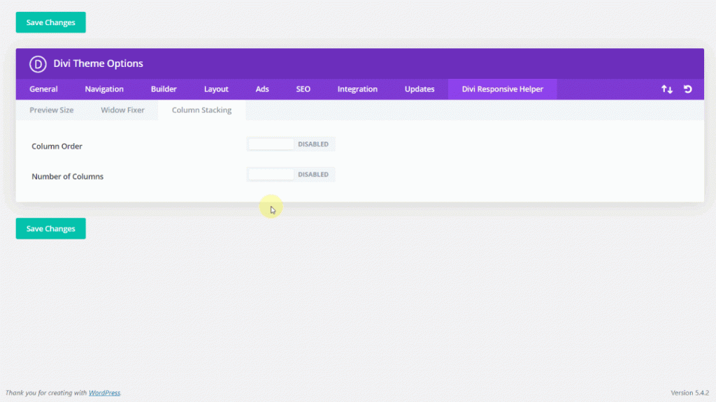
Choose Column Number
If you’d like to have 2 different side-by-side columns, what are you doing? Users can’t do that! But you could do that with the Divi Responsive Helper! their super helpful number column features allow users to choose the number of columns that you’d like to get side-by-side on your phone and tablet.
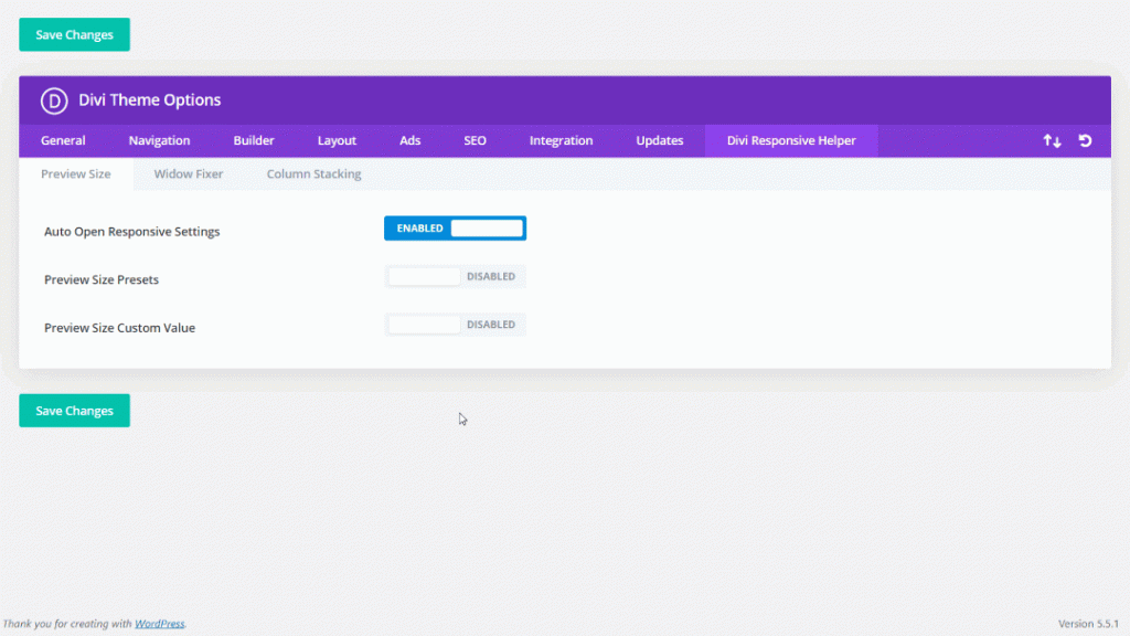
Default Open Responsive Tab
By Using the Divi Responsive Helper you can automatically launch the three Responsive tabs for Tablet, Desktop, and Mobile Phone inside the Divi Builder. This uncomfortable situation is made easy by switching a toggle! Now that you’re ready to create your webite responsive you could even customize the Divi configurations with each device without having to click to launch the tabs between each setting!

Enable Automated Widow Fixer
Don’t you ever get upset by those annoying single words at the end of the sentence or perhaps a paragraph that sits with their own line? It also happens quite a lot on Divi websites, especially mobile devices, and yet many people really don’t realize it.
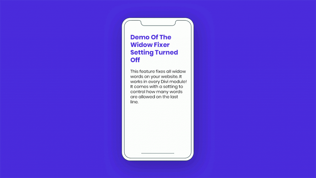
Numerous Divi users will find themselves going to try all sorts of tricks to get rid of these widows, such as soft-return, text-modifying, or CSS techniques that just don’t work. The Divi Responsive Helper makes it easy to a workable solution that stops widows troghout your website.
Advantage
Very easy to use
They have brilliantly combined the functionalities of this plugin into regular Divi environment, such as the Divi Theme Options, and then into all Sections, Columns, Rows, and Modules. Enable or disable the specific features
Incredible time-saver
The Divi Responsive Helper was designed that would save time and help increase effectiveness. Spend a little less time open or close responsive options and shutting down the builder to constantly test the responsive sizes of the screen in the web browser software. Rather than confusion and trouble, spend much more time becoming innovative with your layout design and getting the things done!
Avoid a costly mistake
The standard Divi responsive configurations are awkward, cumbersome, and quite limited. Even worse, it can contribute to stupid mistakes with lengthy loss of revenue. For instance, a badly constructed mobile experience has led to less availability of the search engine, which results in fewer clients and undoubtedly less income in your wallet. Their solutions complete up some confusion so that you can make perfect changes to your Divi websites.
Why do we need a custom preview size for this?
Divi arrives along with 3 primary responsive set points. These are all Tablet (980px-768px) , PC or Laptop (above 981px), and Smart Phone (above 981px) (767px and down). The issue is, such preview sizes are quite limited. To test how your Divi layout looks at some other screen width, you’d have to leave the Divi Builder and then go to the browser developer tools.
The countless back and forth is a problem, and it’s not effective in anyway. Their plugin lets you live configure preview sizes immediately in the Divi Builder. To really be clear, custom preview sizes are also no extra breakpoints. In truth, almost all of the time you don’t truly need to have more breakpoints.
Rather, use thier custom preview size plugin to find the best Divi settings at each of the current Tablet, Desktop, and Smart Phone breakpoints. Make sure, do not adjust the Divi configurations for each of presets or for any custom value that you consider to act as a breakpoint. Instead, just use customizable preview size as a live preview in the Divi Builder and see how the layout looks at every screen size.
Why would we need the Automatic Open Responsive Tab function?
Trying to make your Divi website responsive seems to be easy, but it can be quite confusing at first. Several users think that modifying the preview size for Tablet, Desktop, and Phone, and also adjusting the configurations, will set various unique options to each device. But that’s misleading. You have to open the 3 primary responsive tabs below each Divi setting to create various configurations to every device.
Once you’ve created a wonderful Divi layout on your PCs and are prepared to go thru the your website to make this responsive, it is indeed irritating to get a little responsive icon clicked on each configuration to launch the Responsive Tablet, Desktop, and Phone tabs. This function will open automatically these tabs for you, and save you time and effort.
What is the widow fixator doing?
The widow fix feature checks your the text header and paragraph and also checks how many words you use with the last line. It pushes the words to fit the preferred settings automatically. For instance, when you set the minimal amount to not less than three words with the last line, the words will automatically bump down so there will be three words on last line. This helps make your text appear more professional into all devices.


0 Comments