Basic Divi Tutorial – Divi Builder comes in two forms: the standard “Back-end Builder” and the front-end “Visual Builder”. Both interfaces allow you to build exactly the same type of website with the same content elements and design settings. The only difference is the interface. The Back-end View resides within the WordPress Dashboard and is accessible along with all other standard WordPress settings. This is great for making quick changes while you’re inside the dashboard, but it’s also constrained by the dashboard and displayed as a block-based representation of your website. This tutorial will focus solely on the visual builder.
The Cyber Monday sale has officially begun! For a very limited time, Divi are offering our biggest discount of all time plus free bonus gifts and exclusive perks...and that's just the beginning! Once Cyber Monday is over, this crazy deal won't be back until next year Divi Theme Discount today!
Enabling Visual Builder
When you log into your WordPress dashboard, you can navigate to any page on the front of your website and click the “Enable Visual Builder” button in the WordPress admin bar to launch the visual builder.
If you are editing your page on the back-end, you can switch to the visual builder by clicking the “Enable Visual Builder” button located at the top of the back-end Divi Builder interface (note, you must first activate the Divi Builder Builder before the visual builder button will appear).

Visual Builder Basics
Divi’s strength lies in the Visual Builder, a drag and drop page builder that lets you build almost any type of website by combining and organizing content elements.
Builders use three main building blocks: Sections, Rows and Modules. Using these together allows you to create countless page layout arrays. Sections are the largest building blocks, and they accommodate groups of rows. Rows sit inside sections and are used to house modules. Modules are placed in rows. This is the structure of every Divi website.
Block
The most basic and largest building blocks used in designing layouts with Divi are sections. It’s used to create large content groups, and it’s the first thing you add to your page. There are three types of sections: Regular, Custom, and Full Width. Regular sections consist of rows of columns while Full Width Sections consist of full width modules that extend the entire width of the screen. Custom sections allow for more sophisticated sidebar layouts. For more information on using sections, head over to our in-depth sections tutorial.
Rows
Rows sit within sections and you can place any number of rows within sections. There are many different column types to choose from. Once you have defined the column structure for your rows, you can then place the modules into the desired columns. There is no limit to the number of modules you can place in a column. For more information on using rows, head over to our in-depth row tutorial.
Module
Modules are the content elements that make up your website. Every module that Divi has can fit into any column width and they are all fully responsive.
Building Your First Page
The three basic building blocks (Sections, Rows, and Modules) are used to create your pages.
Adding Your First Part
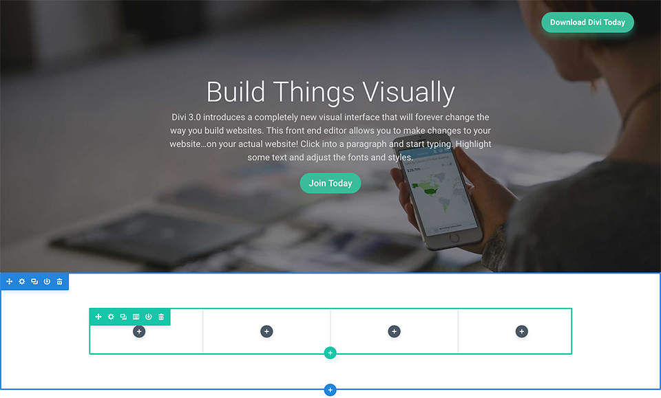
Before you can add anything to your page, you must first add a section. Sections can be added by clicking the blue (+) button. When you hover over an existing section on the page, a blue (+) button will appear below it. When clicked, a new section will be added below the section you are currently hovering over.
If you start a new page, your first section will be added automatically.

Adding Your First Line
Once you’ve added your first section, you can start adding rows and columns within it. Sections can hold any number of rows, and you can mix and match rows from different types of columns to create different layouts.
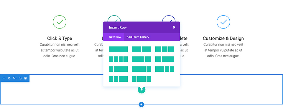
To add a row, click the green (+) button in any empty space, or click the green (+) button that appears when hovering over the current row to add a new row below it. Once you click the green (+) button you will be greeted with a list of column types. Select the columns you want and then you are ready to add your first module.

Adding Your First Module
Modules can be added within rows, and each row can hold any number of modules. Modules are the content elements of your page, and Divi comes with over 40 different elements you can use to create them. You can use basic modules like Text, Images, and Buttons, or more advanced modules like Sliders, Portfolio Gallery, and eCommerce Store. We have individual tutorials for each Divi module, so if you want to learn more about the types of modules Divi provides, be sure to return to the main document page and browse through the “Modules” section.
To add a module, click the gray (+) button in any empty column or click the gray (+) button when hovering over a module on the page to add a new Module below it. Once you click the button, you will be greeted by a list of modules. Select the module you want and it will be added to your page and the settings panel for the module will appear. Using this settings panel, you can start configuring your module.
Configuring And Customizing Sections, Rows, and Modules
Each section, row, and module can be customized in various ways. You can access the element settings panel by clicking on the gear icon present when hovering over any element on the page.
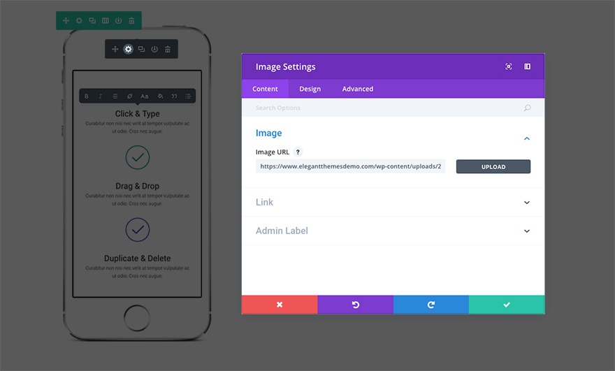
This will launch the settings panel for the specified element. Each settings pane is broken down into three tabs: Content, Design, and Advanced. Each tab is designed to make accessing and customizing a wide variety of Divi settings quick and easy. The Content tab is of course where you can add content like images, videos, links and admin labels. The Design tab is where we place all the default design settings for each element. Depending on what you’re editing, you can control various design settings with a single click; including: typography, spacing (padding/margins), button styles, and more. For an in-depth look at the Design tab. Finally, if you want more control, you can head over to the Advanced tab where you can apply custom CSS, adjust visibility by device, and (depending on which element you’re editing) make finer tuning.
Saving Your Page And Accessing Page Settings
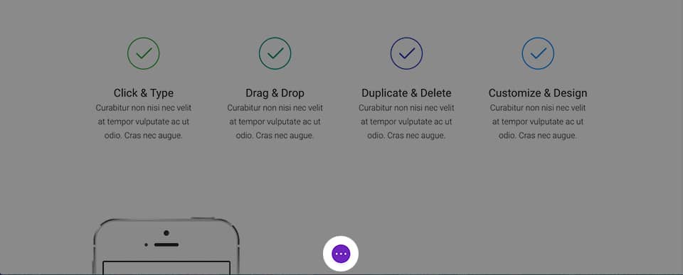
To access the general page settings, click the purple dock icon at the bottom of your screen. This will expand the settings bar and give you various options. You can open your page settings by clicking the gear icon. Here you can customize things like page background color and text color. You’ll also find Save and Publish buttons and a responsive preview toggle.
Start Your Design with a Pre-Created Layout
A great way to start your new page is to start with a pre-built layout. Divi ships with more than 20 pre-made layouts covering various common page types, such as “About Us”, “Contact”, “Blog”, “Portfolio”, etc. You can load this and then trade the demo content for yourself. Your new page will be finished before you know it! To learn more about using pre-made layouts.
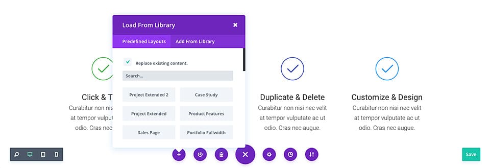
Saving Your Own Layouts to the Library
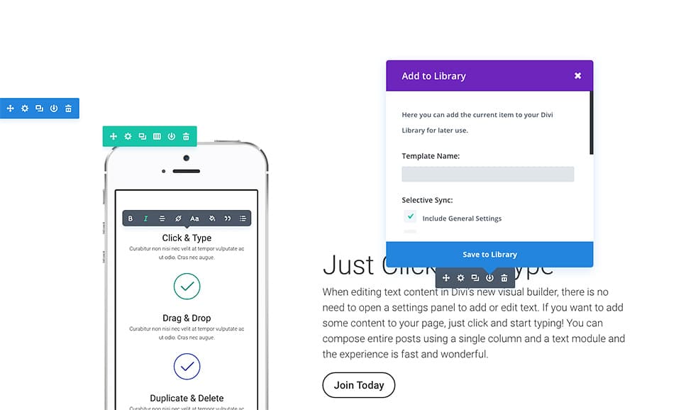
In addition to using the pre-made layouts included with Divi, you can also save your own creations to the Divi Library. When a design is saved as a Divi Layout in the Divi Library, it can be loaded onto a new page. The more you build a library with your favorite designs, the faster you can create a new website. For a deeper look in the Divi Perpustakaan Library
To save an item to a library, click the existing library icon while hovering over any element and within the page settings bar. Once an item is added to the library, it will appear in the “Add From Library” tab when adding new Divi layouts, sections, rows, and modules.



0 Comments