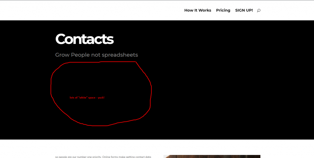
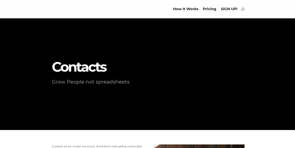
Most popular trend we have seen at the time is the “mostly” full-screen header– with its actual content of the page looking out at the bottom of the window, encouraging the audience to scroll. It was not only technically perfect, but it also looks really good. The problem is when you create the Divi full width header bigger than to the content within the header, this is all sitting up at the top, leaving a lot of horrible room at the lower part.
Below is a sample before and after to make verticall central content that to get the sense of what we’re going to do:
Before
The Cyber Monday sale has officially begun! For a very limited time, Divi are offering our biggest discount of all time plus free bonus gifts and exclusive perks...and that's just the beginning! Once Cyber Monday is over, this crazy deal won't be back until next year Divi Theme Discount today!

After:

This piece of code will centrally vertical all content within the full width header and lets you can choose the ratio height of the full width header element as well.
height: 80px;
display: flex;
flex-direction: column;
justify-content: center;
height: 80px;
display: flex;
flex-direction: column;
justify-content: center;
Please ensure that’s in the Custom CSS Main Element section of the Full Width Header DIVI module.


0 Comments