


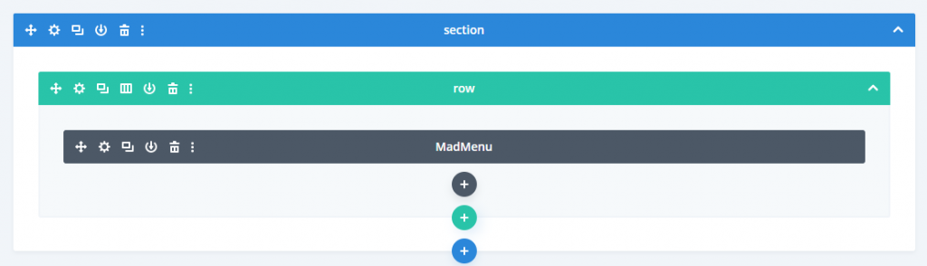
Divi MadMenu is a versatile and efficient menu module to generate headers by using Divi Builder.
Divi MadMenu Addons Features
- 7 Header Elements are present
- Divi MadMenu covers the main header elements:
- Menu Desktop
- Menu Mobile
- Website Logo
- Web Search
- Cart
- Button one and Two
- Activate one or all of the header elements to fit your needs.

That’s also responsive!
You could build a header that looks awesome on any device using an one Divi MadMenu module. You no longer need to build separate header templates for your mobile and desktop devices!
The Cyber Monday sale has officially begun! For a very limited time, Divi are offering our biggest discount of all time plus free bonus gifts and exclusive perks...and that's just the beginning! Once Cyber Monday is over, this crazy deal won't be back until next year Divi Theme Discount today!

Easy Header Interface Structure
With numerous header elements in a only one module, you can build headers with a simplified layout design. The Divi MadMenu header from all 7 allowed elements has a structure as easy as this.
Set Column Width and Page Alignment
Every element is included within the column, so you can change the width of the column and the alignment of the contents in a sensitive manner (both horizontally and vertically ).

Differently order the elements around each device
You may need a logo (or any header element) upon this right hand side of your desktop screen, but also on the left side of your mobile device. With Divi MadMenu, you can do that by clicking on it, these header elements could be re-ordered in a sensitive manner.
Responsive Visibility Control Elements
Display/hide the allowed header elements on various devices (Tablet, Desktop, and Phone)
Totally customizable
Each header feature has two similar sets of configuration options (space, height, color, shadow box, border, etc.) – one for the Standard header and another for the Fixed header.
This gives a lot of flexibility in terms to building the header differently for both regular and fixed conditions and also for each system.
Show contents of WooCommerce Cart
Display the contents of the cart (total amount or item count ) in the header. Customization options including an update option for AJAX.

Adjust the animations menu
Add various animations to the mobile device menu (closing and opening ) and the computer menu submenus.
Set a menu breakpoint
Monitor the visibility of the mobile and desktop menu by placing customizable breakpoints.
This option allows you to set an unique breakpoint in which the desktop menu is substituted by a mobile menu, or even use just one of them on different devices, or even activate both mobile and desktop menus at the very same time.

Use your custom picture icons
search, Cart, Button One and Two elements both allow you to either use Divi’s original font icons or import customized image icons. This opens up a lot of new idea possibilities.
Apply specific menus to each device
Develop menus with various structures/items (in Appearance->Menu) and allocate them to the relevant device (Desktop, Phone and Table ) (Desktop, Tablet and Phone).
This feature is particularly helpful if you’ve a very complicated desktop menu layout and must have a simpler configuration menu for mobile devices.
Add the buttons to the CTA header
You don’t need to use a different Button Module if you’d like to provide a CTA button in the header, Divi MadMenu offers the Button One and Button Two elements exactly for this reason.
The button components could be used as icon-only , label-only or icon&label button. The visibility and location of the button and label icon could be set differently with different devices.
More Smartphone Menu Access
Collapse the submenu.
Disable/enable collapsed parent submenus elements.
Activate accordion mode that allows you to have only one extended submenu at a time.
Using Icon, label or Label&Icon as a mobile menu toggle (like the “hamburger” menu).
Completely configure your mobile menu items , menu container, and submenu elements.
Fixed header positioning
The fixed header may be placed either at the top or bottom of the viewport. When put on top, you can even choose either to shift the contents of the page (e.g. when the header has a strong background) or to cover the contents of the page (suitable for headers with transparent background).
Fully prepared header templates are freely available!
Divi MadMenu arrives with ready-to-use header templates to jumpstart your header design process. Only upload the demo header, modify the contents and colours, and you’re ready to go!


0 Comments